Making Data Fun
Leading UI design for a data visualization project that doubled monthly press clippings.
The Swedish Entrepreneurs League was a project for STRATO's International PR team. The goal was to transform freely available Swedish government statistics into something visually stimulating and easy to understand—presented as a football league where each municipality competes for the "net growth cup."
The Challenge
Press releases were boring
The PR team was working to build STRATO's reputation as a business expert in Sweden, but press releases about net growth statistics were not capturing attention.
Data needed life
Raw government statistics are available to everyone, but no other brand was doing anything creative with them. We needed to claim this space with visual storytelling.
Complex requirements
The project required designs for desktop, mobile, and tablet views, complete component libraries, multiple sub-pages, and a comprehensive style guide.
My Approach
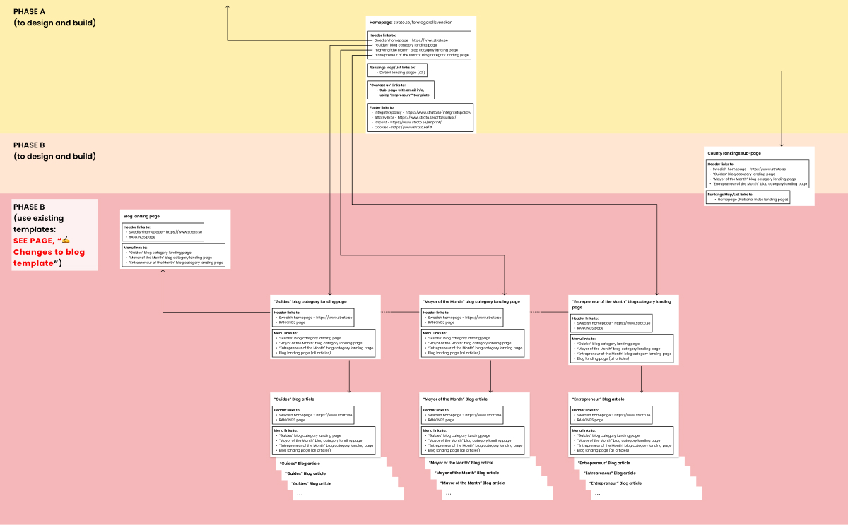
I started by prioritizing the acceptance criteria and creating a comprehensive sitemap to understand the full scope of pages and interactions needed.
Structure first
Created a detailed sitemap showing all pages, navigation paths, and content relationships. This helped identify potential UX issues before any visual design work began.

Iterative wireframing
Briefed a junior designer to create initial wireframes, after two feedback rounds I took over to polish the UI and refine interactions. This approach allowed us to move quickly while maintaining quality.

Comprehensive design system
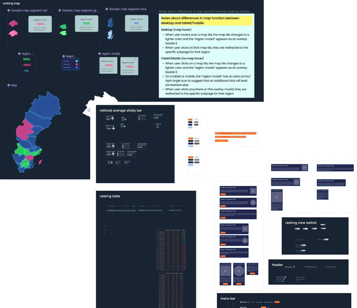
Developed a complete component library with all states (normal, hover, active), responsive behaviors, and clear documentation for the development team.

The Solution
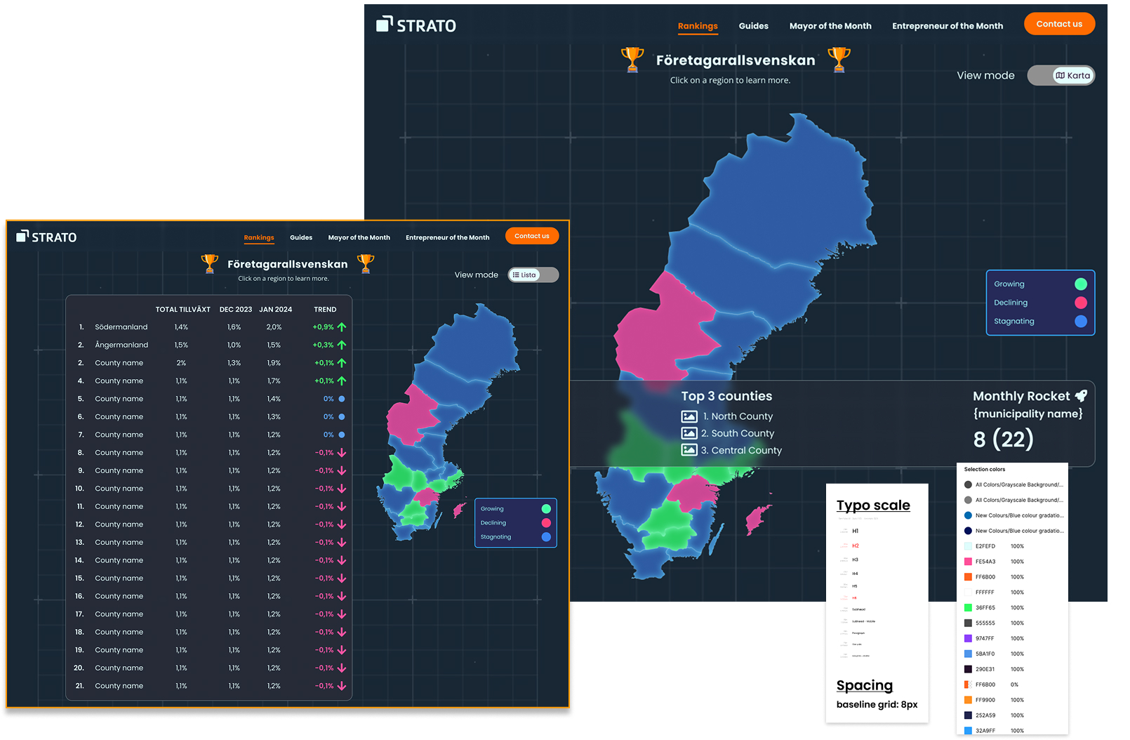
An interface inspired by football standings, styled like a stock market terminal, that made data exploration intuitive and engaging.

The rankings interface with map and table views
The design transformed dry statistics into a competitive narrative, where users could explore growth trends across Swedish municipalities through an intuitive, visually compelling interface.
The Results
Design System Delivered
Created complete Figma designs for homepage, district landing pages, blog templates, and all interactive components across three viewport sizes.
Development Handoff
Provided comprehensive style guide with typography systems, color definitions, spacing guidelines, and component specifications for consistent implementation.
Impact
Since the site went live, STRATO's monthly press clippings in Sweden have doubled, successfully establishing the brand as a go-to source for business growth statistics.
Key Takeaways
Data Storytelling
The right visual metaphor can transform boring data into an engaging narrative that people want to explore and share.
Systematic Approach
Starting with structure (sitemap and wireframes) before visual design prevented costly rework and ensured all requirements were met.
Design Systems Matter
Comprehensive component documentation enabled smooth development handoff and maintained design consistency across the entire site.