Building a Design System That Scaled to 10 Brands
How STRATO's tokenized design system became the Ionos Group standard
Timeline
14 months
June 2023 - August 2024
Team Evolution
6 designers → 3 core team
Cross-brand adoption
Component Efficiency
40% reduction
in duplicates
Ultimate Outcome
Ionos Group standard
across 10 brands
The Challenge
The Situation
When I joined STRATO as Lead UI Designer in May 2023, the design team of six was drowning in inefficiency. Every designer had their own way of organizing components—some maintained personal master files, others created new files for every ticket. Three partially-finished pattern libraries sat deprecated and unmaintained, abandoned the moment they were "finished."
The Cost
The chaos had real consequences:
Wasted Resources
Designers were accidentally rebuilding components that already existed, buried in someone else's files
Missed Deadlines
Design-dependent tickets routinely spilled over sprints because time estimates didn't account for duplicate work
Siloed Teams
Engineers in different product streams (web portal, control panel, cloud storage) had drifted into incompatible tech stacks, forcing designers to bridge huge technical gaps
Professional Credibility
The design team was seen as the bottleneck in the development cycle
Why Previous Attempts Failed
My predecessors had tried to solve this with documentation—style guides, pattern libraries, usage instructions. But manual documentation fell out of date immediately. What we needed wasn't more documentation; we needed a system that enforced consistency automatically and adapted to different technical requirements without manual intervention.
The breakthrough came from timing: STRATO had just fully migrated to Figma, and Figma was about to release the tool we needed.
The Opportunity
Research & Vision
Even before starting at STRATO, I'd been researching design tokens and their potential to transform productivity. During my interviews, I talked about this vision with the design team—and I could see that two designers (David Dutschke and Chris Stüberitz, both juniors interested in code) were energized by the idea.
The timing was perfect: STRATO had just fully migrated to Figma, giving us—for the first time—a single platform where all designers could collaborate.
The Missing Piece
Initially, we planned to use a third-party plugin for design tokens. But between our first and second workshop with engineers, Figma released Variables—their native design tokens implementation. This was the breakthrough we needed: a scalable, Figma-native solution that could serve multiple tech stacks from a single source of truth.
The Process
Phase 0: Alignment (Week 2)
Two weeks after starting, I facilitated an all-day workshop bringing together designers, engineers, and product owners across all product streams. Most people in that room had never met before—that's how siloed we were.
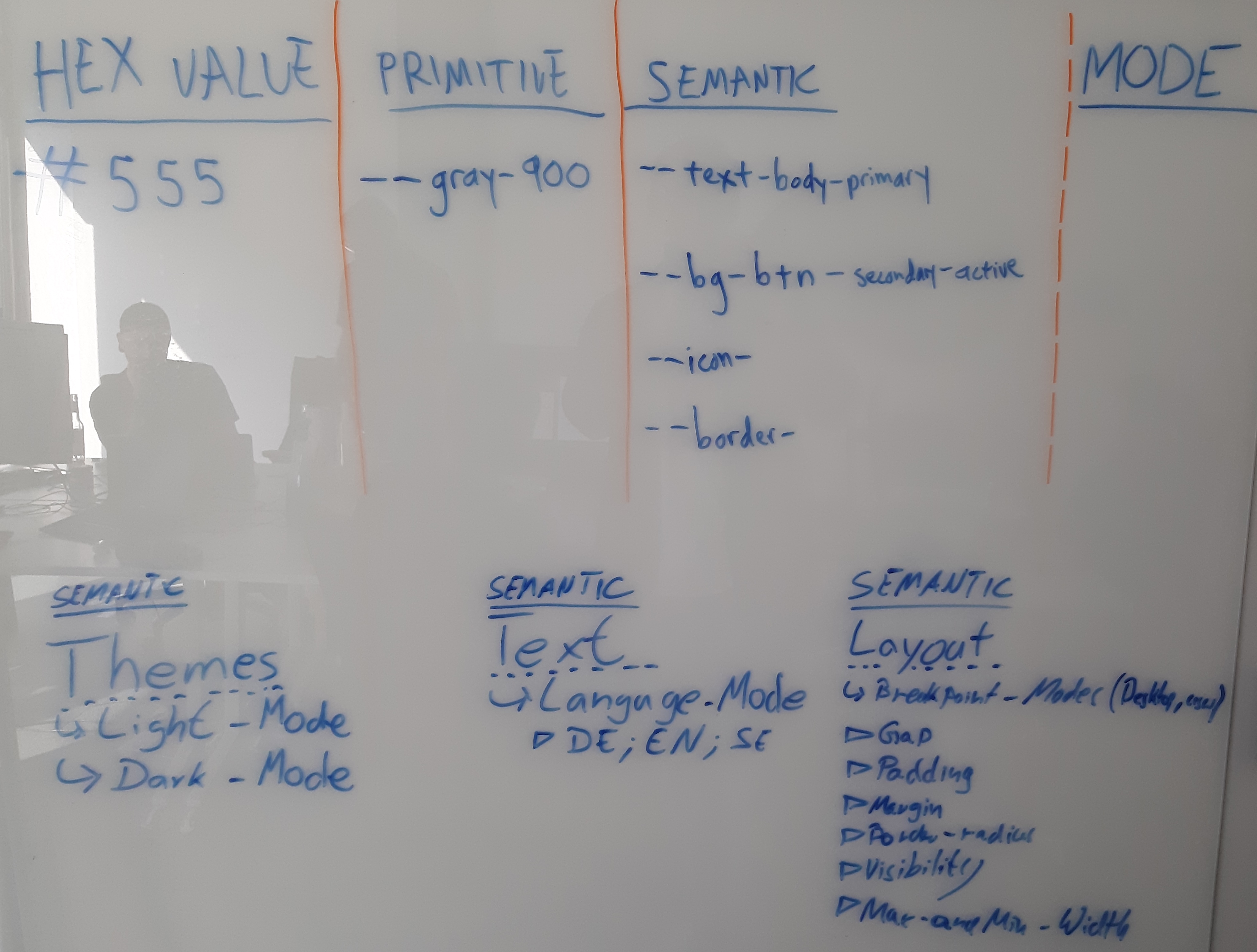
Early workshop whiteboard showing the token hierarchy concept and introduction of Variable Modes
Workshop Outcomes:
- Commitment from one engineering lead per team (6 teams total)
- Agreement on atomic naming conventions (primitive → semantic → component)
- Realization that our single source of truth had to be in Figma, not code (incompatible tech stacks)
- Uncovered that engineers across teams weren't talking to each other—kickstarted cross-team technical alignment
The Resistance
Not everyone was convinced. Some engineers remembered past abandoned attempts at design systems and were skeptical this would be any different. But I didn't need everyone on board—I only needed one point of contact per engineering team for the project to get started. The skeptics came around when they saw their colleagues' support for the project and monthly progress demonstrations.
Phase 1: Audit & Consolidation (Months 1-3)
All six designers conducted an audit of components in their respective platform areas. We created our first unified Figma file containing all versions of all components from every STRATO platform.
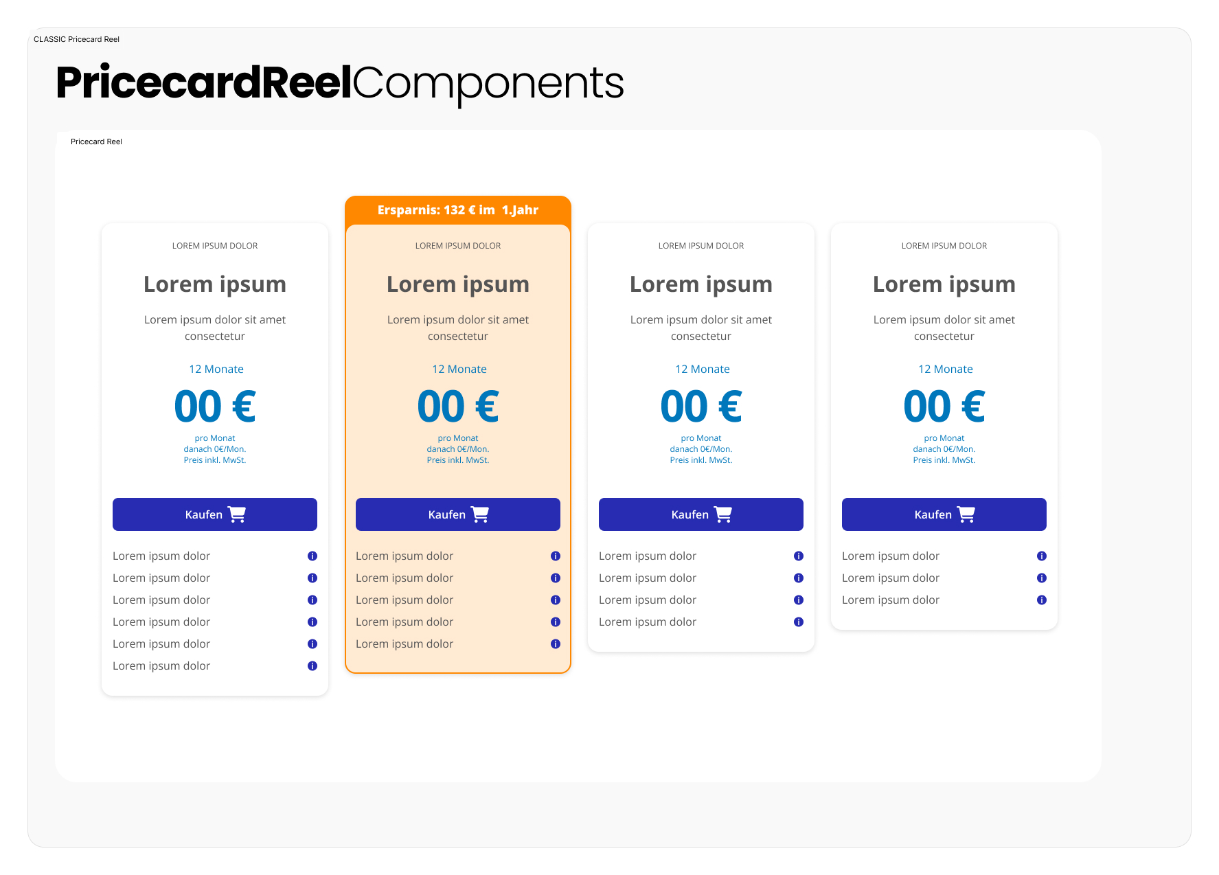
Price card components - example of the complex nested components we needed to systematize. These appeared on every product page in comparison carousels.
Then we hit a coordination bottleneck: trying to consolidate components across platforms with all six designers was too slow. I reduced the core design system team to three (myself, David, and Chris) so we could move faster.
Strategic Constraint: EAA Accessibility Deadline
Parallel to this project, we were preparing for the European Accessibility Act (June 2026 deadline). This hard deadline actually focused our priorities: we tackled typography, type scales, and colors first, since getting brand color changes approved—even for accessibility—had a long approval timeline.
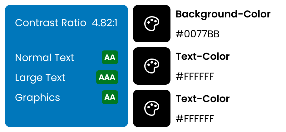
Accessibility testing: ensuring color contrast ratios met EAA requirements (4.82:1 for all text sizes)
Resource Reality
The design system was never anyone's main project. All three of us still had regular design duties in our respective product streams. This constant time and resource pressure meant we had to be strategic: we used the highest-priority sprint deliverables to determine what to refactor in the design system next.
For example, when the web portal team needed to migrate to a new CMS, they had to refactor price card components. Price cards appeared prominently on every product offer page in comparison carousels. That external pressure became a perfect opportunity to focus on the complex UI of nested components as a design system priority.
This "zigzag path" kept the design system relevant and useful instead of becoming an ivory tower project.
Phase 2: Foundation Building (Months 4-8)
Following atomic design principles and naming convention best practices, we built our token architecture:
Token Hierarchy:
Raw Values (hex codes, pixel values, font families)
    ↓
Primitive Tokens (color-blue-500, spacing-md, font-sans)
    ↓
Semantic Tokens (color-primary, spacing-section, font-body)
    ↓
Component Tokens (button-background-primary, card-padding)
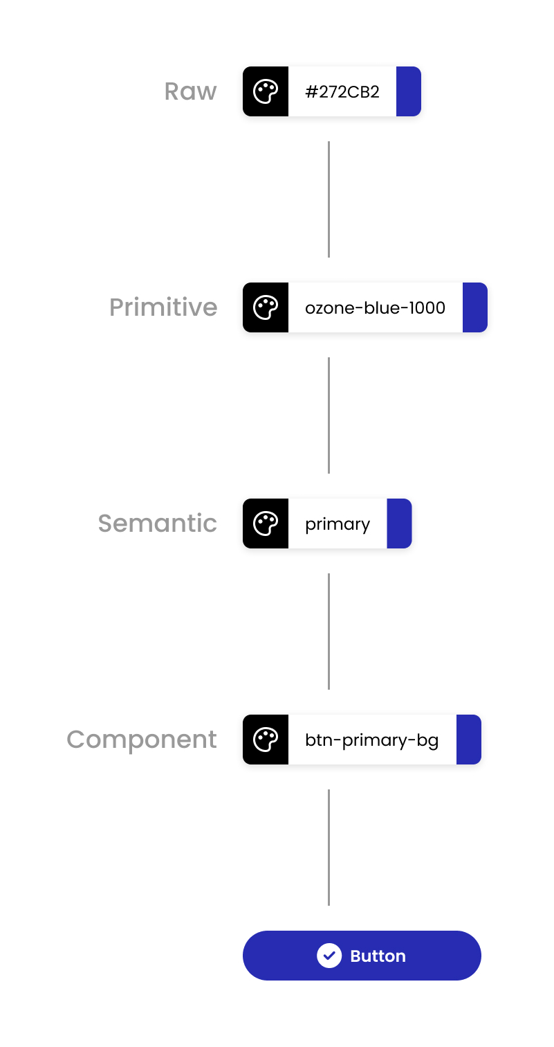
Token hierarchy in action: how a single color value flows from raw → primitive → semantic → component → final UI
We started with cards as our first complex component—they contained buttons, text, surfaces, borders, and shadows, so building cards forced us to nail the foundational tokens.
Prioritization: We focused on most-used tokens based on the audit and upcoming sprint tickets.
Phase 3: The Innovation (Months 6-12)
Here's where we made a leap that would later convince Ionos leadership to adopt our system company-wide:
Figma Variable MODES for Multi-Platform Serving
Figma designed Modes for light/dark theme switching. But we realized: What if each Mode represented a different platform or brand?
This meant:
- A single button component could be built once
- Web portal engineers got the web portal version
- Control panel engineers got the control panel version
- HiDrive engineers got the HiDrive version
- No duplicate components needed
Instead of 5 versions of every component (one per platform), we had 1 component with 5 modes.
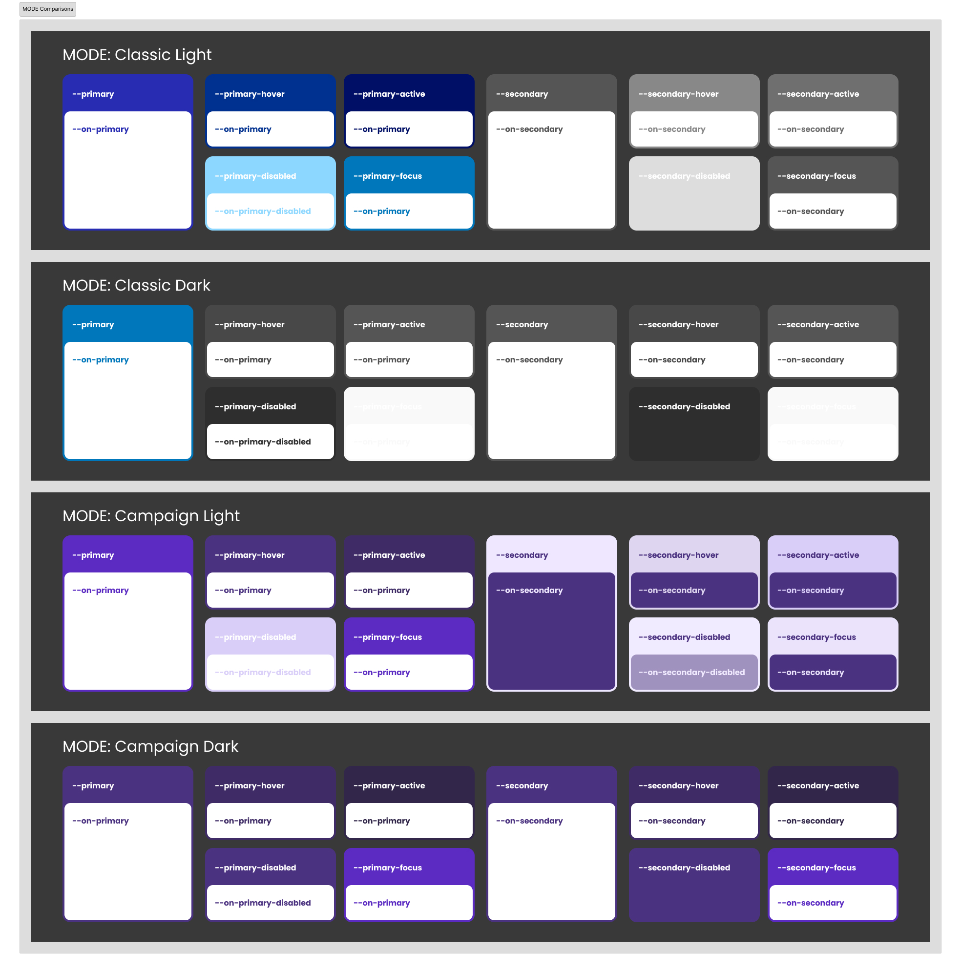
The innovation: One button component serving four different Variable Modes (Classic Light/Dark, Campaign Light/Dark) with all interaction states
This was the game-changer
Different brand stylings could be reduced to Variable Modes—no separate systems needed.
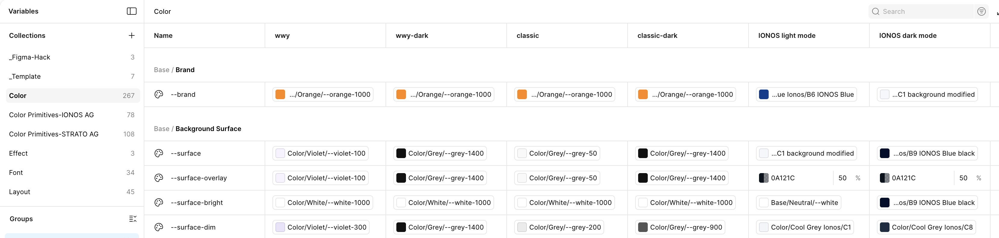
Behind the scenes: Figma Variables panel showing six brand/theme modes (wwy, classic, IONOS × light/dark) managing all color tokens from a single source
Phase 4: Adoption & Validation (Months 10-14)
We measured success through sprint velocity: design-dependent tickets finally matched their effort estimates instead of spilling over.
Cultural Shift
The design system project catalyzed broader changes in how designers and engineers collaborated:
Designer Behavior Changes:
- Showed WIP designs to engineers before end of sprint (not after designs were "perfect")
- Spent one day per week sitting with their engineering counterparts
- Broke the habit of "hiding" until designs were polished
Engineer Empowerment:
Engineers learned to use Figma as a tool, not a burden. When Figma released Dev Mode partway through our project, David and Chris created a cheat sheet showing engineers how to find the most relevant specs they needed. This accelerated the handoff process significantly—engineers could surface design specs much faster.
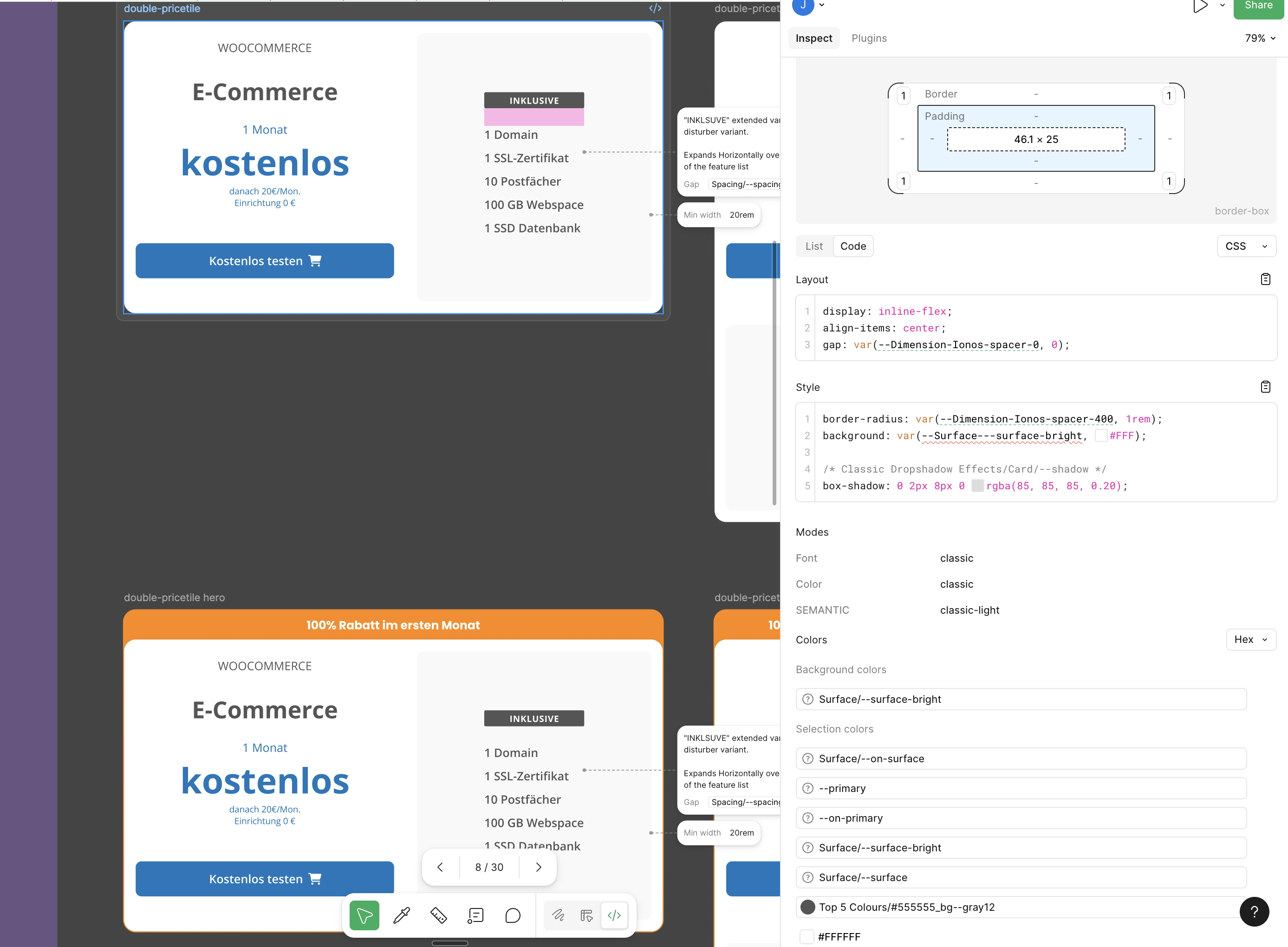
Figma Dev Mode in action: Engineers could inspect components and see token references directly in the code panel, with Variable Modes visible at bottom right
Cross-Product Stream Collaboration:
Engineers from different product streams started talking to each other (some for the first time), kickstarting conversations about consolidating differing processes and tech stacks.
Bi-weekly CoP Meetings
Designers, engineers (6 teams), and POs (5 total) met every two weeks for design system discussions. My boss (Head of UX) and her boss (VP of Customer Platforms, Guido Bartz) were informed, not consulted—we operated as a strategic internal product with ongoing iteration, not a finite project.
The Impact
Quantifiable Results
40% Reduction in Duplicate Components
The leaner, cleaner component library eliminated wasted effort.
Sprint Velocity Restored
Design-dependent tickets stopped spilling over sprints. Time estimates finally matched reality.
Time Saved per Designer/Engineer
Fewer design-to-dev handoff issues meant less back-and-forth, less rework.
Unexpected Bonus: Marketing Agility
Marketing campaign development time decreased significantly. Applying campaign-specific styling became a matter of creating a new Variable Mode instead of manual design work for each campaign asset.
The Ultimate Validation: Company-Wide Adoption
In August 2024, Ionos Group (STRATO's parent company) underwent a restructuring focused on efficiency. Leadership was looking to consolidate redundant systems across 10 brands.
Our VP of Customer Platforms, Guido Bartz, pitched our design system to the Ionos board.
Why We Won:
Multi-Brand Capability
Different brand stylings could be reduced to Variable Modes—no separate systems needed. This was unique among the 10 brands' approaches.
Agile Approach
Our modular, adaptable system could be used before it was "finished"—unlike some brands' slow, waterfall approaches that produced obsolete components by the time they were done.
Proven Track Record
Sprint velocity improvements and 40% component reduction demonstrated real business value, not just design theory.
Early Adoption Network
Through informal bi-weekly UX knowledge-sharing calls across all 9 brands, curious designers had already adopted our techniques. This grassroots buy-in made full adoption an easy sell—designers weren't being forced to adopt something unfamiliar.
A centralized design system team was formed at Ionos Group. I was offered the role of Design System Lead, with Chris Stüberitz (no longer a junior after his solid work) and two designers from the parent company joining the new team.
Skills Demonstrated
What This Project Required
Systems Thinking
Seeing the design system not as a collection of components, but as an ecosystem connecting designers, engineers, products, and brands. Understanding how changes in one part ripple through the whole.
Stakeholder Management
Navigating relationships with 6 engineering leads, 5 POs, 6 designers, and leadership—knowing who needed to be consulted vs. informed, and when.
Technical Knowledge
Understanding design tokens, Variable Modes, Figma's REST API, and how different tech stacks (web portal, control panel, iOS, Android) needed different outputs from the same source.
Facilitation
Running workshops that broke down silos, built consensus, and kept momentum. Creating spaces where designers and engineers could collaborate as equals.
Strategic Product Management
Treating the design system as an internal product with a roadmap, priorities, and iterative releases—not a finite deliverable.
Removing Barriers
Negotiating with POs to protect designers' capacity for the project. Planning in phases. Aligning with EAA deadline. Using sprint priorities to guide design system work.
My Role: Orchestration
While everyone contributed collectively, my unique contribution was keeping the machine running:
- ✓ Decided to do it: Brought the vision and secured initial buy-in
- ✓ Removed barriers: Negotiated with POs to leave designers capacity for the project
- ✓ Planned the build: Created the phased approach aligned with EAA deadline and sprint realities
- ✓ Facilitated everything: Every workshop, every CoP meeting, every cross-team discussion
- ✓ Kept focus: When other priorities threatened to derail, I kept the team on track
"I kept the machine running and removed barriers so everyone could focus. My job was to ensure this project didn't become just another deprecated pattern library."
Reflection
What Made This Succeed
Right Timing
Figma Variables released exactly when we needed it. STRATO had just fully migrated to Figma. The EAA deadline created helpful constraints.
Cross-Functional from Day One
Engineers weren't just consulted—they were co-creators. We designed the system with them, not for them.
Strategic Constraints Helped
The EAA deadline focused our priorities. Sprint demands kept us pragmatic.
Cultural Shift Mattered
Breaking down silos between designers/engineers and between engineering teams created lasting collaboration beyond the design system itself.
Internal Product Mindset
Treated design system as ongoing optimization, not finite project. This made it sustainable.
Business Value Front and Center
Focused on sprint velocity and efficiency, not just design craft. This earned leadership buy-in.
Starting Small
I didn't need everyone on board—just one point of contact per engineering team. Skeptics came around when they saw progress at monthly demos. I would have moved faster if I'd understood this from the start.
What I'd Do Differently
Move Faster with Less Upfront Buy-In
I spent too much time early on trying to get buy-in from too many stakeholders. Buy-in came easier after the project started and there was something concrete to show (rather than theoretical).
The minimum number of key stakeholders I needed was actually much lower than I thought: one engineer per product stream. If other engineers and POs were skeptical, having one representative per tech stack willing to give a couple hours per week was enough.
With that support, the design system gained credibility each month at department status updates. Skeptics turned into allies as they saw tangible progress.
Lesson: Sometimes you have to start building before everyone believes in the vision.
Why I Left
When offered the Design System Lead role at Ionos in August 2024, I chose to pursue a new challenge at Smart Agency (building AI-assisted products). I'd achieved what I set out to do—prove the system's value and see it adopted company-wide.
I wanted to build something new from scratch rather than maintain and scale what we'd built. That's where I thrive: in the 0→1 phase, bringing order to chaos and establishing foundations for others to build on.
This project taught me that the hardest part of design systems isn't the technical implementation—it's the cultural transformation.
You're not just building components; you're changing how teams work, communicate, and trust each other.
What started as a solution to design inefficiency became a model for how an entire company could collaborate across brands and platforms. And it proved that with the right timing, the right team, and relentless focus on business value, design systems can scale beyond anyone's initial vision.