Earning Users' Trust
How I helped a new startup increase its onboarding rate by 935%.
Smart Agency was an ambitious spin-off of the Marketing Agency TERRITORY, creating a platform for small businesses to automate their marketing with AI. I joined shortly before the product went live, but I saw three major flaws with the MVP that was about to be released.
The Problem
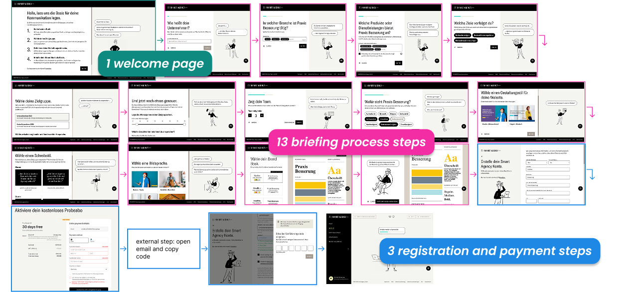
The signup process had 17 steps
- 1 welcome page
- 13 briefing process steps
- 3 registration and payment steps
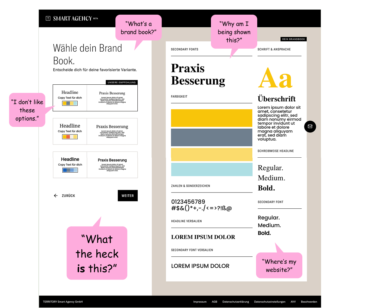
Test users were confused by the result
We showed an abstract "brand book" when they expected to see an AI-generated website.
"What's a brand book?"
"Where's my website?"
"What the heck is this?"
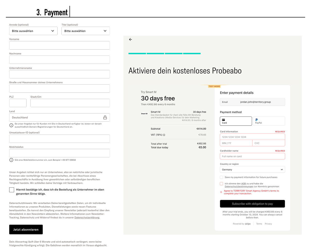
Payment required before seeing value
Users had to provide business and payment details BEFORE they could see the product. As an unknown entity, Smart Agency was expecting too much user trust before showing any value.
My Proposal
Let users see the platform features for themselves before we ask them to choose a plan or provide payment details.
This is an established best practice for new SaaS products that lack brand recognition or have an unfamiliar kind of product. Smart Agency had both of those problems, so expecting users to provide payment details (even with a free first month) was not going to work.
Move account creation to step 1
Reasons:
- Get users' emails in our system up-front so CRM can contact them even if they don't complete the briefing process
- Jumping straight into answering briefing questions confused test users. Account creation sets expectations
- User can come back and complete the briefing later without losing their progress
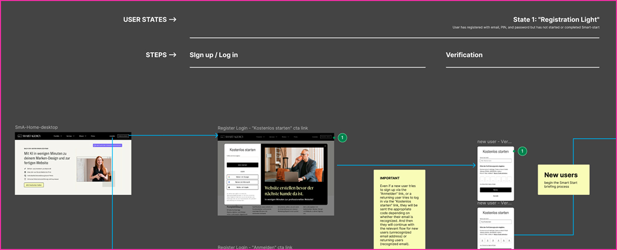
Implementation:
- Create account without a password
- After email verification, user is logged in
Redesign the briefing result to match expectations
Reason:
The main USP on the Smart Agency website and in marketing campaigns stated: "GENERATE YOUR COMPANY WEBSITE IN MINUTES," so users expected to see their website after answering all the briefing questions. Seeing a brand book instead felt to them like a bait and switch.
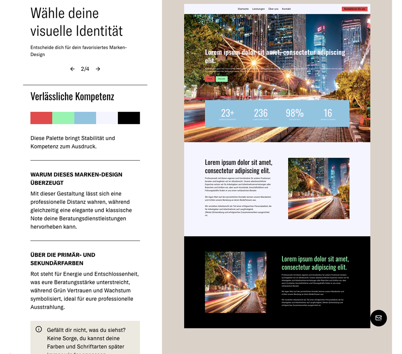
Note: For legal and technical reasons, we could not do the actual website generation at this step, so we needed to redesign the brand book to look like a website preview.
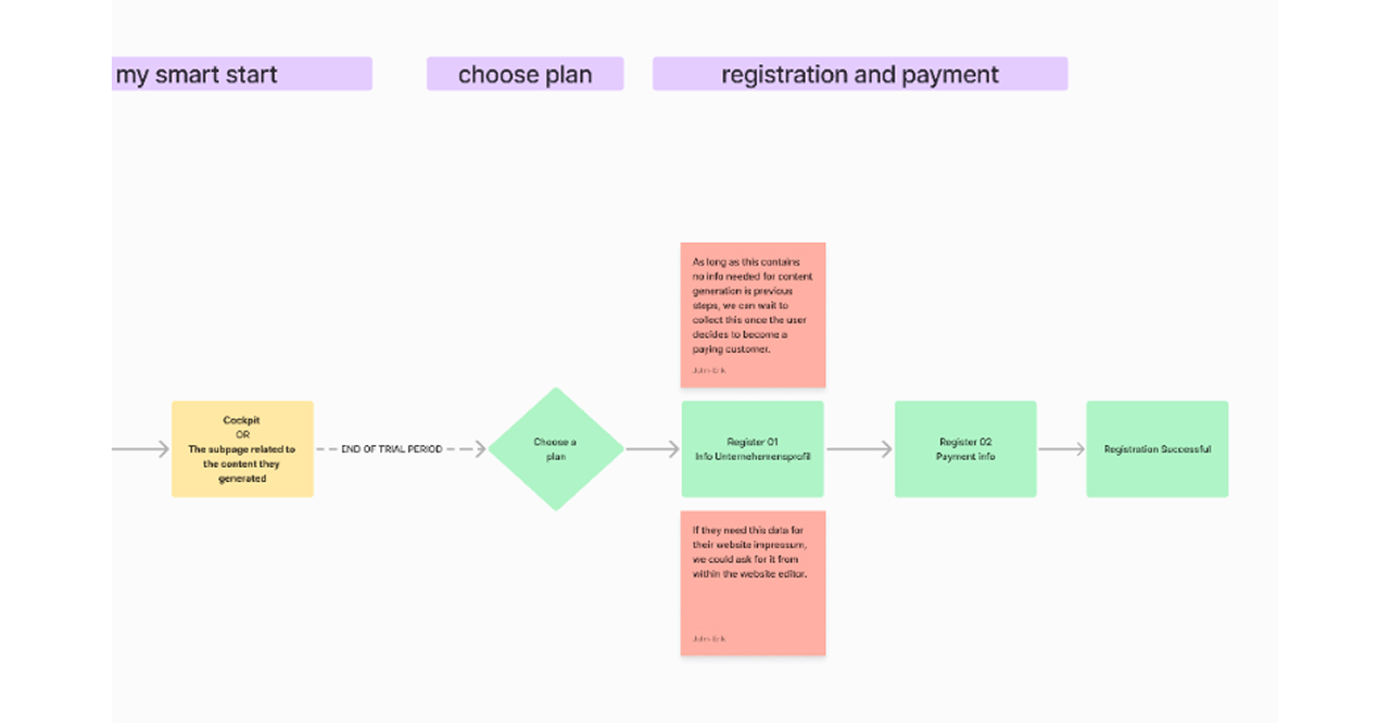
Move registration and payment after onboarding
Reasons:
- There was no compelling user-centric reason for account creation to be linked to company registration and payment
- The freemium model allows a user to access the platform quickly, after a short account creation process. The platform itself becomes a marketing tool, as users see the value of basic features for themselves, but also see what more can be unlocked with a paid plan
The Challenge
Accepting my proposal would mean rejecting the revenue-first business model that the C-Suite had prepared; a model where users were locked in to an expensive subscription after a 30-day free trial.
My proposal required a paradigm shift to a "Freemium" model where users can play around with feature-limited platform tools for free and upgrade to a paid plan once we had proven our value.
My proposal would touch all the product streams and generate a lot of JIRA tickets.
My proposal was a challenge to the status quo
and Leadership rejected it...
until after the product went live.
Making My Case... Again
A week after launch, I had the data I needed to make my case in terms that leadership and POs would accept.
Only 2% of visitors finished the onboarding process.
And they all subsequently canceled their plans before the 30-day trial was up.
Critical Insight
The highest drop-off rates occurred on the steps I had first flagged and proposed alternatives for.
My proposal was no longer an unnecessarily risky challenge to an agreed-upon set course. It was the SOLUTION to a new existential problem: literally nobody was signing up for the platform.
All the previous stakeholder resistance disappeared. Reframed and repackaged for the new reality, my three small proposed tweaks didn't look so risky anymore.
The Results
Approval
My re-proposed onboarding flow was approved by all stakeholders a month after the product launch.
Implementation
All four product streams worked on all cylinders for three sprints in order to implement all the necessary changes to the front end and back end.
I liaised with all POs during the process, and also worked as an IC redesigning the brand book step.
Impact
5 days after we shipped these updates, the onboarding completion rate had increased by 935%.
Key Takeaways
Data Changes Minds
When stakeholders aren't initially receptive to UX recommendations, real-world data from launch can reframe the conversation entirely.
Trust Must Be Earned
For unknown brands, asking for payment before demonstrating value creates an insurmountable barrier. Show first, ask later.
Persistence Pays Off
Being willing to re-pitch a rejected proposal when circumstances change is crucial. The best idea at the wrong time needs patience.